Mississauga Humane Society Website Redesign
Helping pets find their forever homes.
Helping pets find their forever homes.
The Mississauga Humane Society is a local animal rescue in my hometown. Operating solely on donations and volunteers, my classmates and I decided to redesign their website to simplify the information architecture and address some graphic issues.
We were limited in support we receieved from MHS due to us being unable to make contact with them. Regardless, we conducted qualitative research and testing to determine the websites issues and ammend them.
UX/UI Designer
Figma, Invision, Miro, Google Suite, Trello
2 Weeks
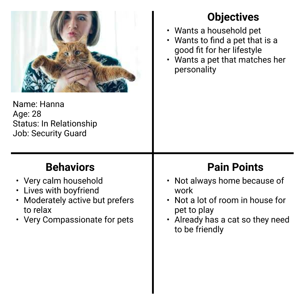
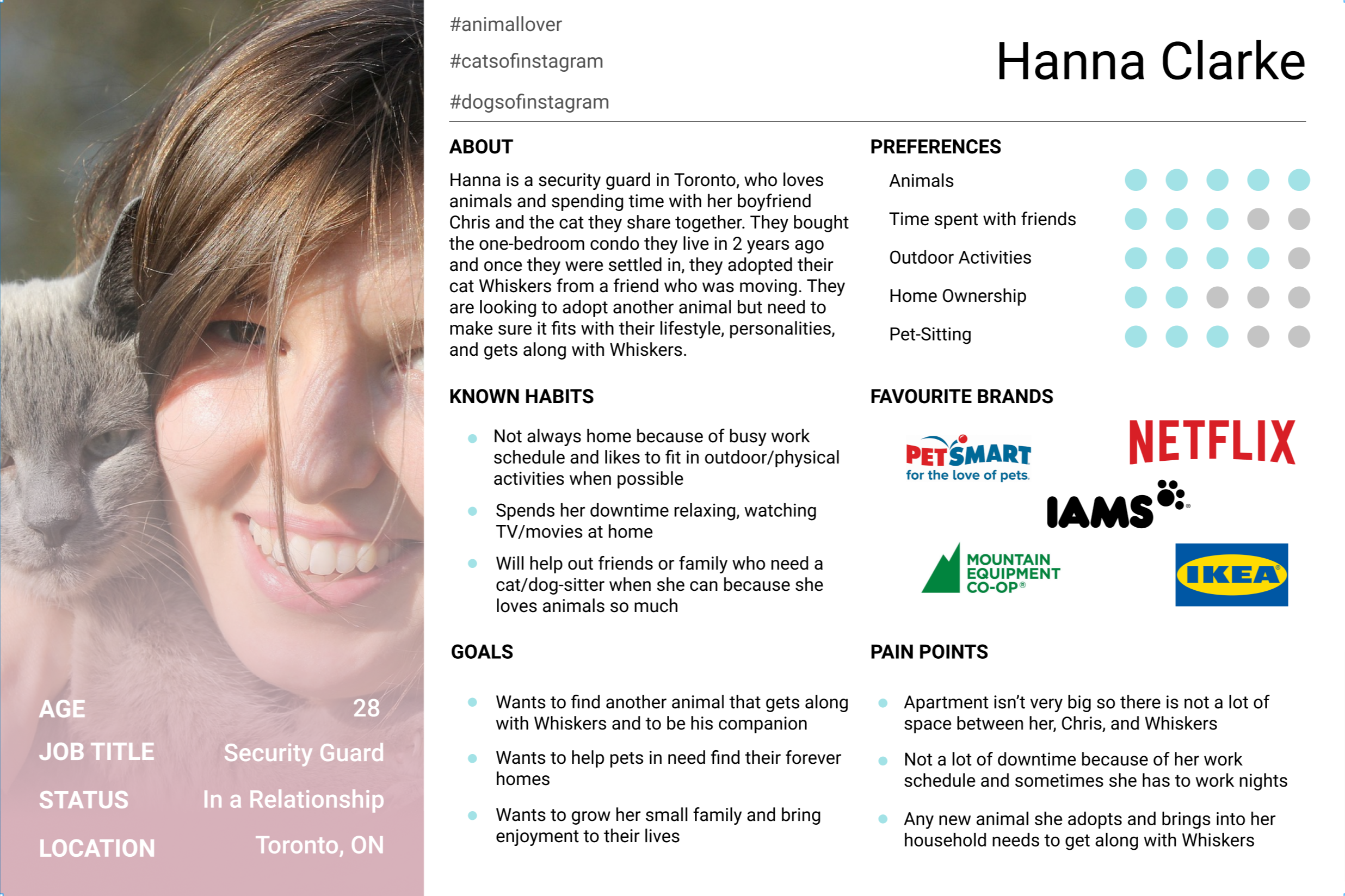
Our research process was that of a standard redesign. We began by creating a proto-persona to outline the average MHS user. Our completed proto-persona reflected many common issues as well as objectives for our users.
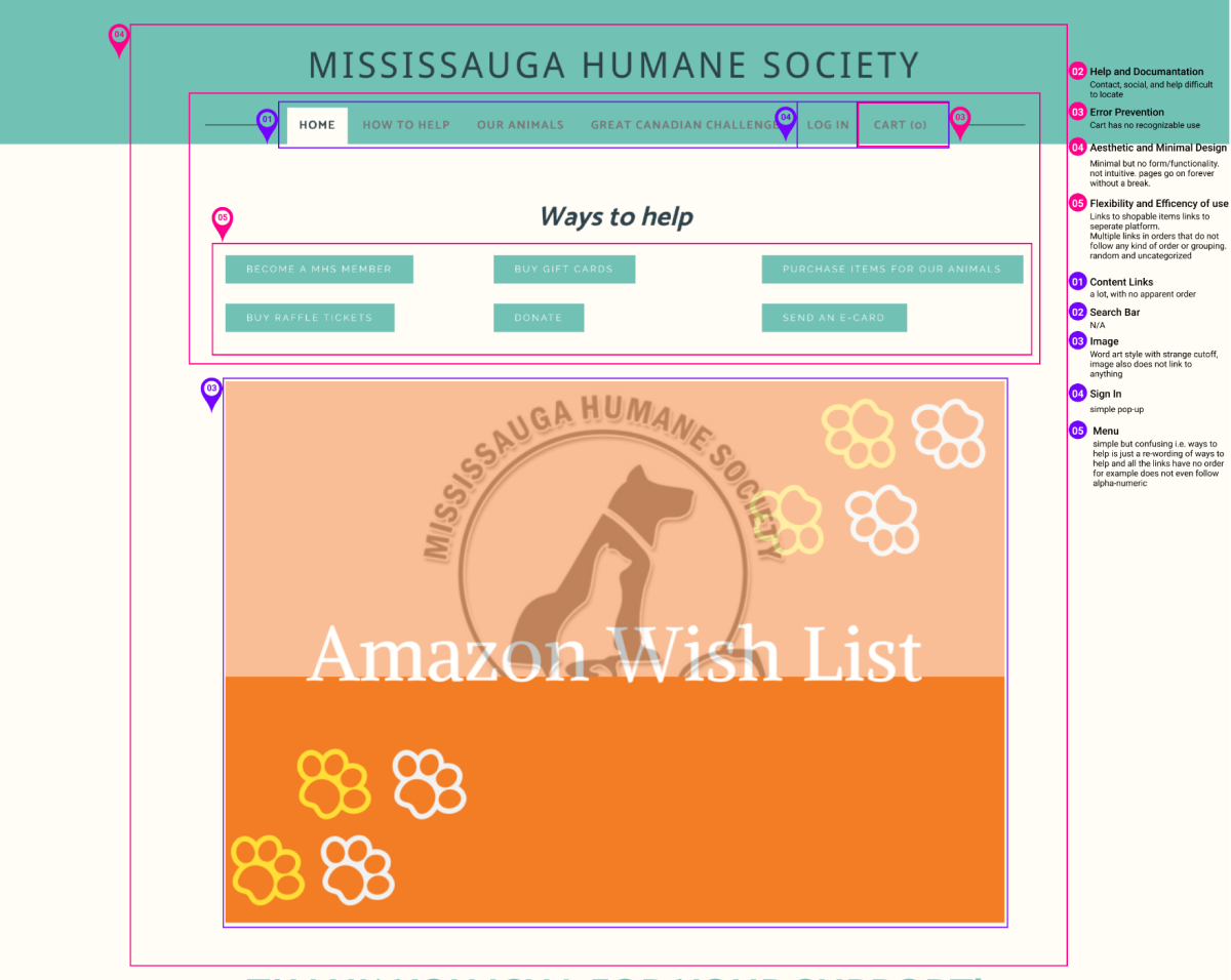
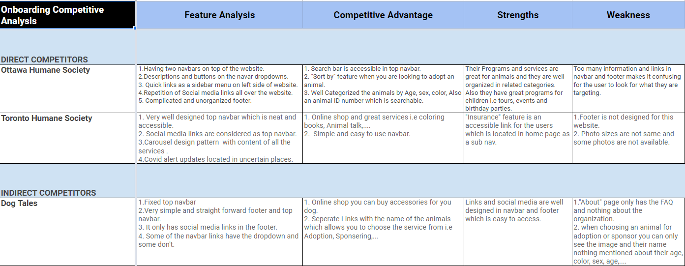
After this, we set out to complete several evaluations. This includes redlining the site, a heuristic evaluation, colour accessibility evaluation, and a competitor analysis to see how the MHS stacks up around other humane societies in surrounding cities. Here are some examples.
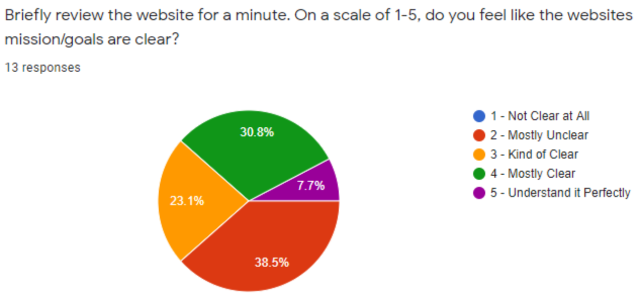
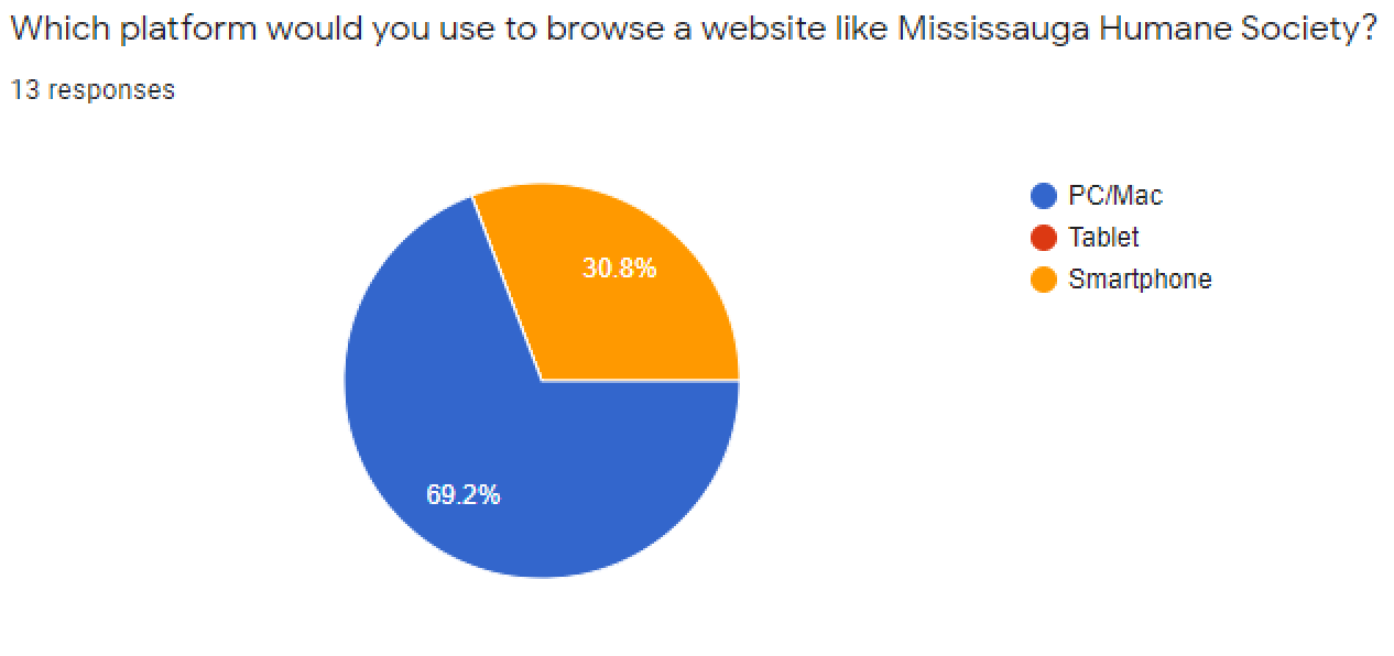
To gather data directly from users, we went ahead and made a survey to gain some basic insights such as what platform people would use to browse our website and so on.
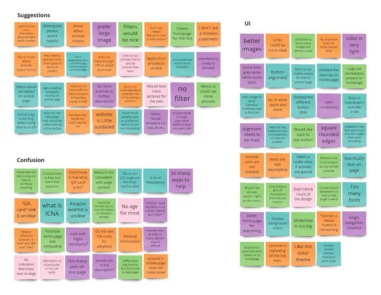
The final and most qualitative data we gathered was our user interviews/tests. We brought on current and potential pet parents to complete a series of tasks that would show flaws in the websites user flow.
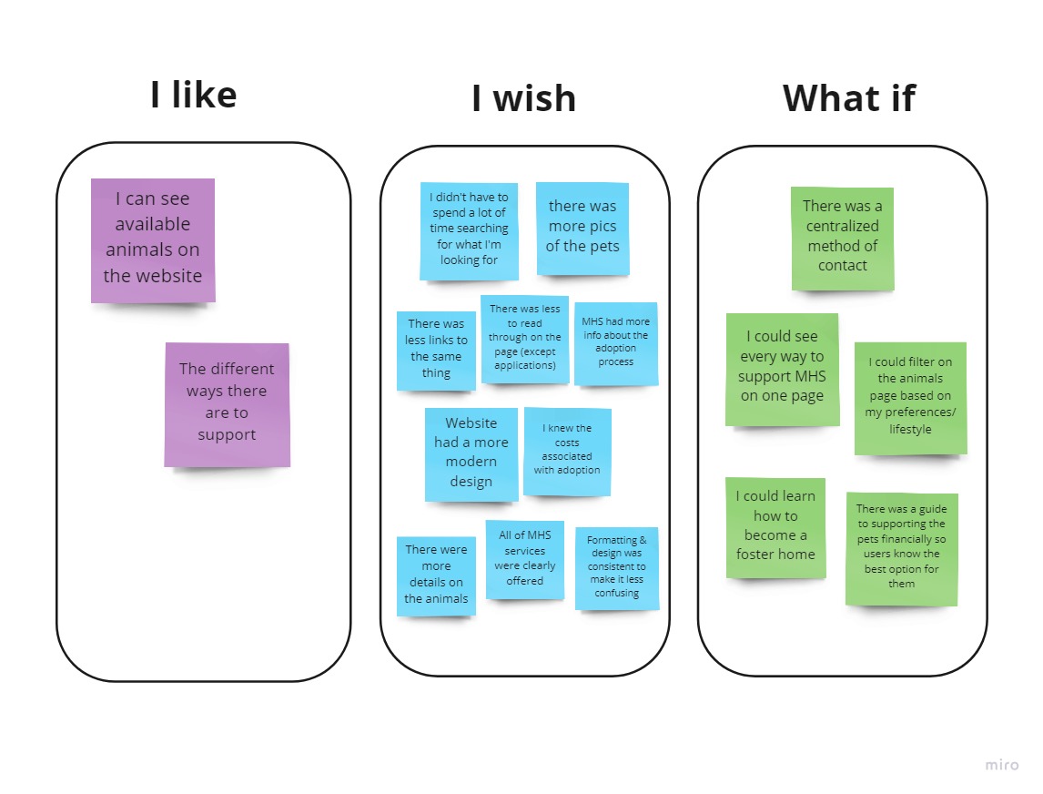
With the data we recieved from our interviews, we sorted them out in a affinity diagram. The result gave us three consistent catergories which include Suggestions, Confusion and UI.
From the data we recieved in the affinity diagram, we updated our user-persona with a clear outline of our users needs and pain points.
With our user persona, we were able to finalize our problem statement:
With our research complete, we put ourselves in the users shoes and began to ideate. To do this, we employed the I like, I wish, What if method so that we can come up with some impactful features and solutions.
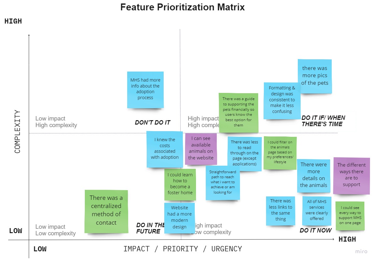
Once we got all our features, we used a feature prioritization matrix to sort our ideas and decide what's most important for the user.
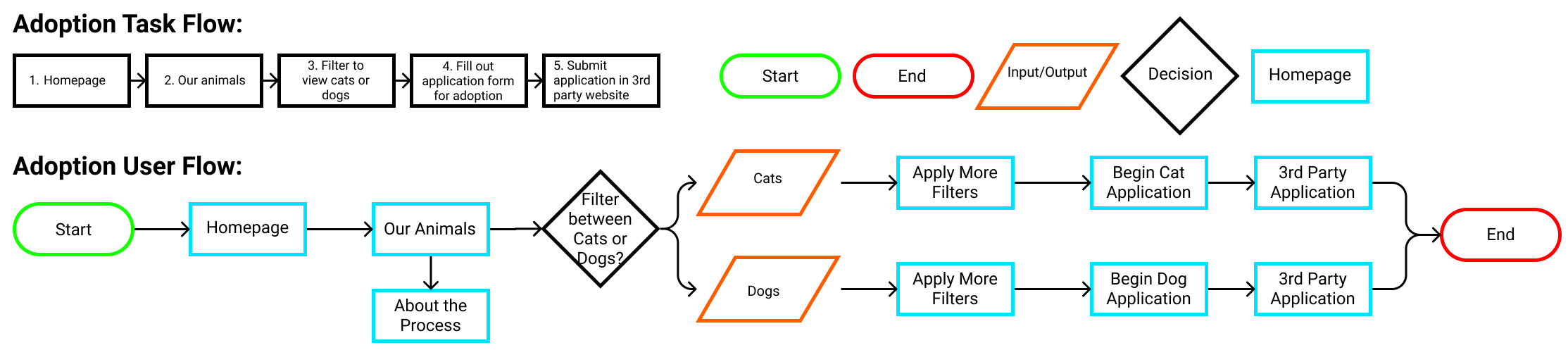
After that, we set out to make a new user flow based on our interviews and new features. The three pillars of our new user flow was as follows:
Eliminate repetitive links and only keep what is absolutely necessary.
Allow all users to access necessary links and information within a few clicks.
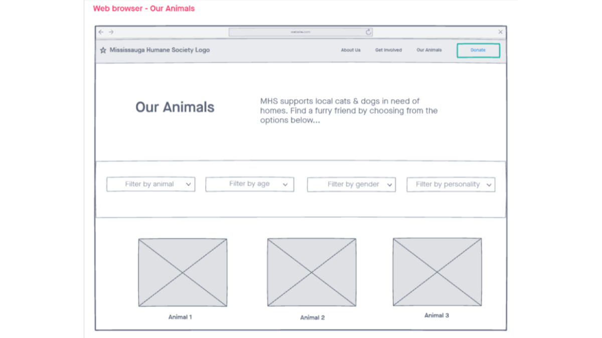
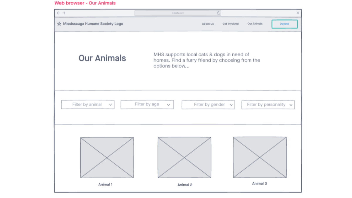
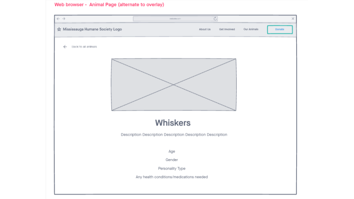
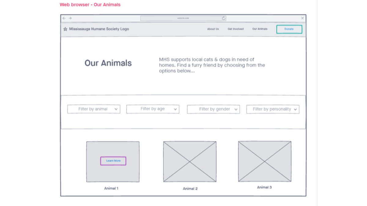
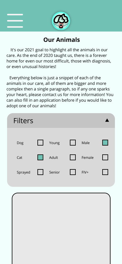
Redesign the animal showcase page so that users may filter to find animals best for them.
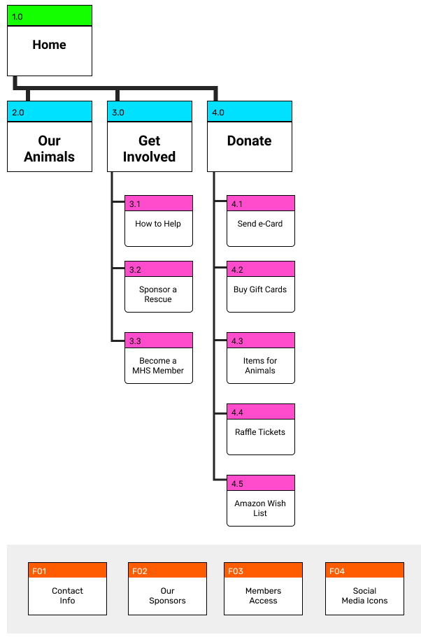
Based on our new and simplified user flow, we solidified it into a sitemap so that we could begin wireframing and prototyping.
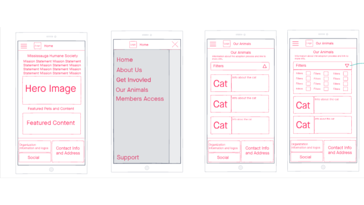
With our research and ideation complete, we started to visualize the design via wireframes. With multiple people adding design input, we used InVision Freehand to sketch out multiple concepts and then votes amongst ourselves to see which wireframes we would run testing on.
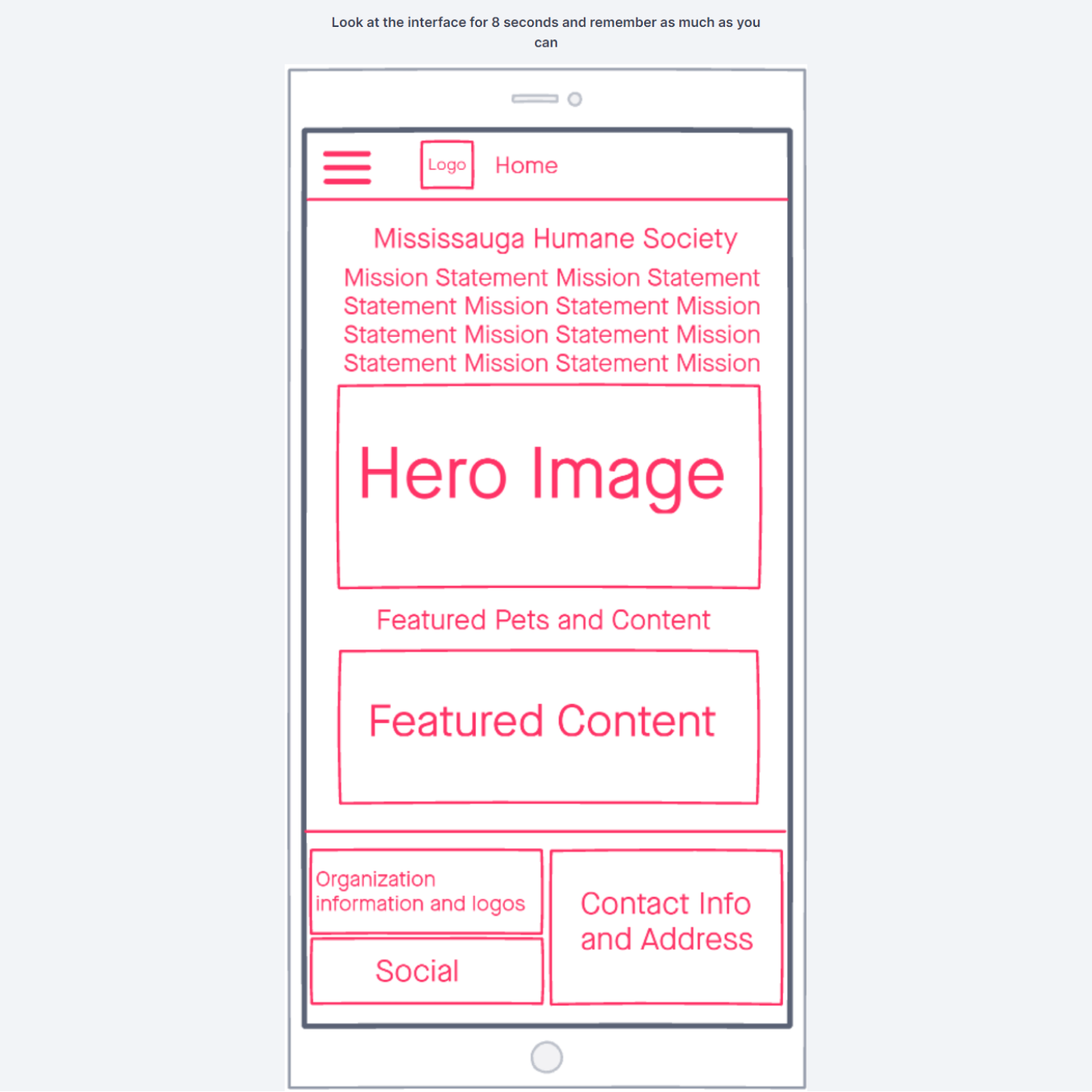
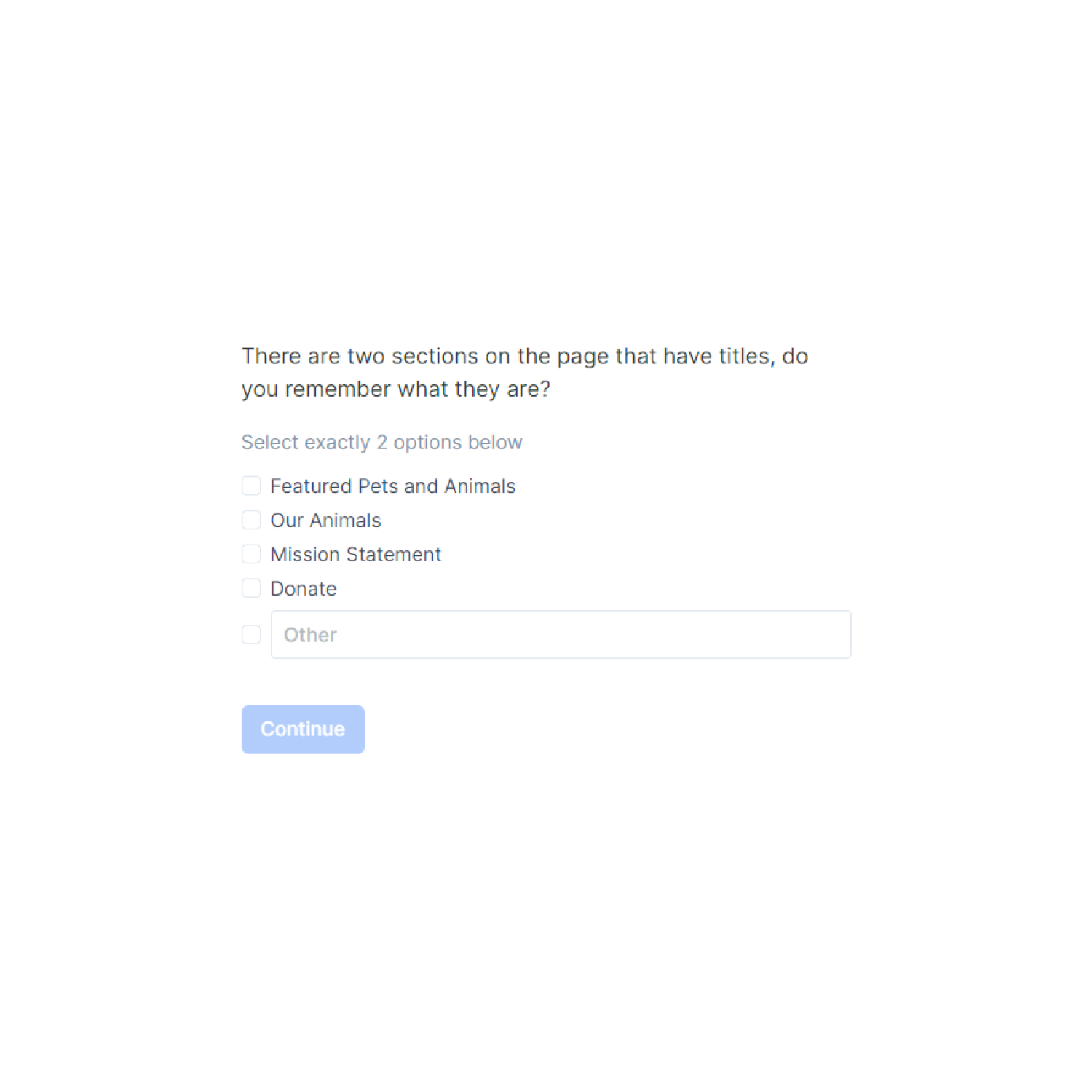
With our wireframes completed, we took our best concepts and set up a 5-second test to see which ones the users liked most. We did this first so we wouldn't waste our time prototyping something the users might not even like. Here are some examples of the questions that were asked.
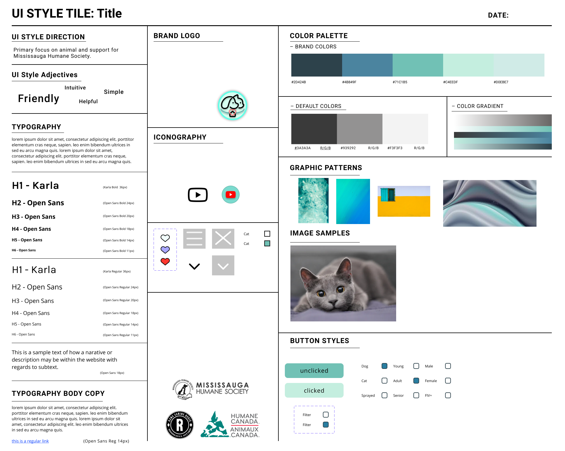
While doing testing, we also worked on a style-tile that followed a similar path to that of the original website. Users were very receptive of the current colour palette so we decided to keep it. We did redesign a higher fidelity logo to compliment the colour scheme as the original website barely had one present. Some other notable parts of the style-guide was the shape and structure of the new and highly requested filtering system.
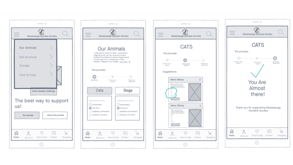
Now that we have 5-second test results and a completed style tile, we went straight ahead to mid-fidelity prototyping. This involved style-tile incorporation, but not all the MHS content was available. This prototype was developed to test the new information architecture as well as if the reception of the style-tile was still positive.

We managed to recruit four participants for testing of our prototype via zoom. We had 3 tasks for them to complete. Some of the insights we recieved were:
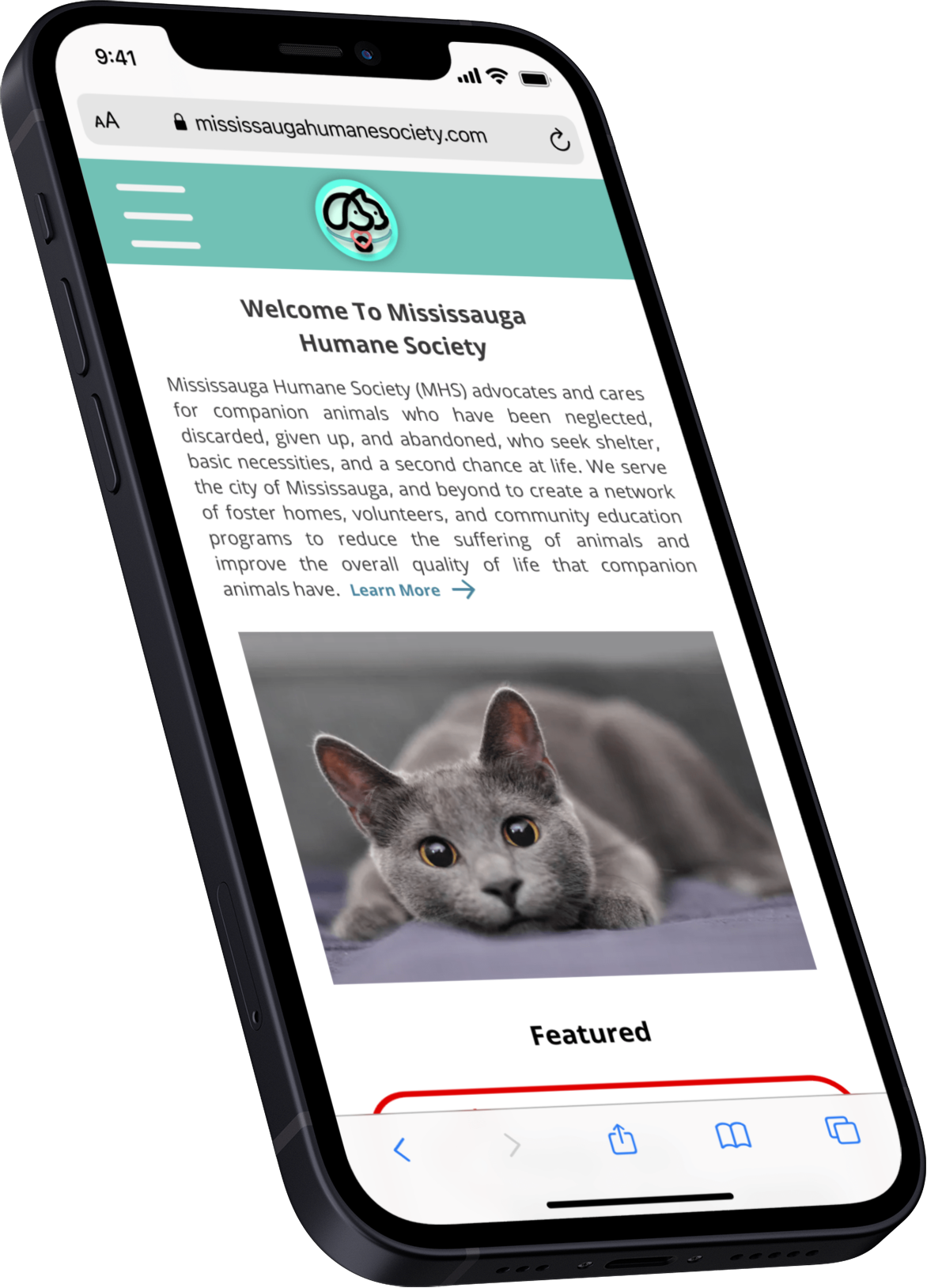
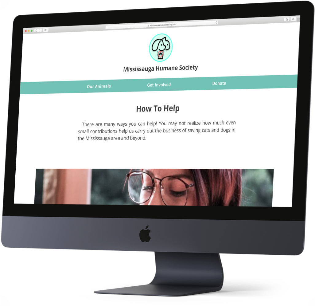
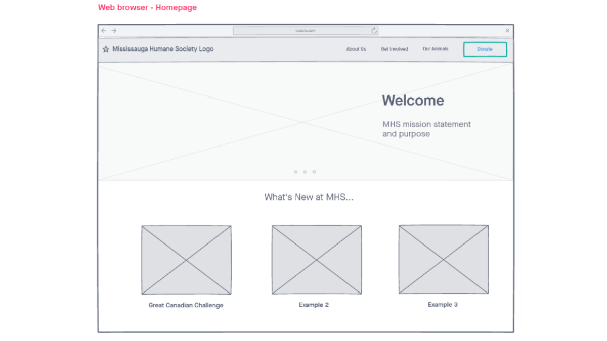
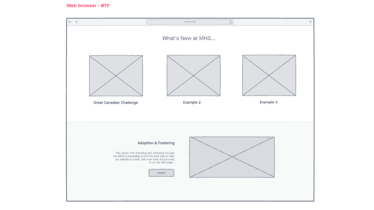
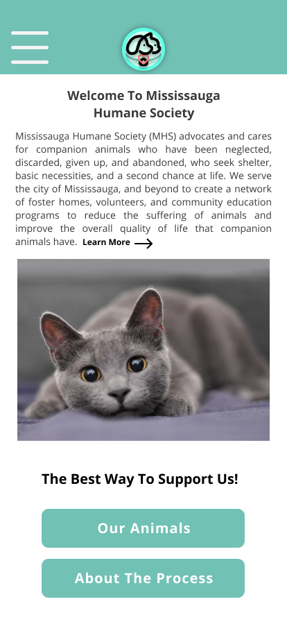
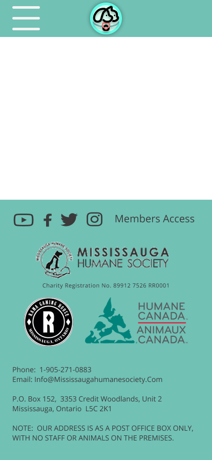
With our mid-fidelty prototype having a mostly positive reception, we set out to make it hi-fidelity and responsive. This meant converting our design from the mobile form that it was in to a standard 1080p computer screen. We did not conduct user testing on this prototype due to time constraints so no further iterations were made. We did however apply all feedback from the last prototype so not much was changed other than the content. During the presentation of the case study, the site had very positive reception and we did recieve some good qualitiatve feedback. I hope that one day, we will be able to do more iterations and actually implement this design to the MHS website. Please click on the each of the respective images to view the completed prototype.
There are many take aways for this school project. The first and most important one in my eyes is the fact that even a small website such as the Mississauga Humane Society can have so many miniscule issues that result in a very displesant user experience. Fortunately, many of these were easily identified in our user testing on both the original website and the prototype and were swiftly resolved. Aside from that, sometimes keeping it simple with the actual design is far more important than over reaching into the visual effects of the webpage. The redesign left users with more relevant information, better ways to help and overall less confusion. While we were not able to reach the MHS to implement our design, we will continue to contact them and I will update this case study if they allow us to do so.


All projects showcased on this portfolio are properties of Michael Khoury and collaborators unless otherwise specified. Please contact if you have any concerns.